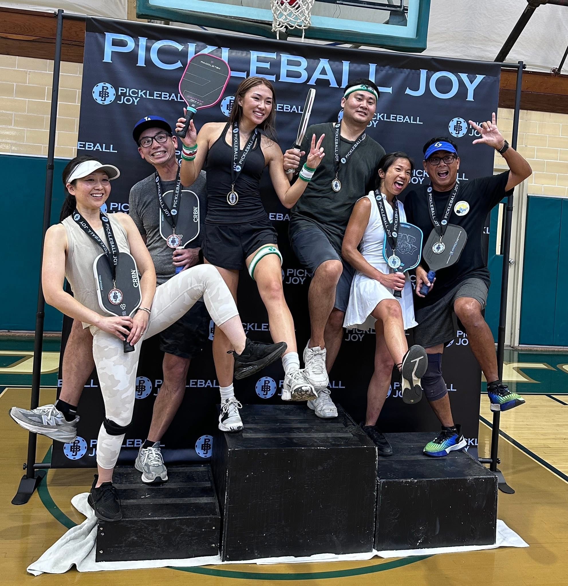
A new visual identity for ︎Pickleball Joy, a 501c3 nonprofit organization that seeks to share the joy and blessings of pickleball with people in areas of the world where they have yet to hear about pickleball.
Branding and Identity
Branding and Identity
JOY is an acronym for:
Jesus first
Others second
You last.
Others second
You last.
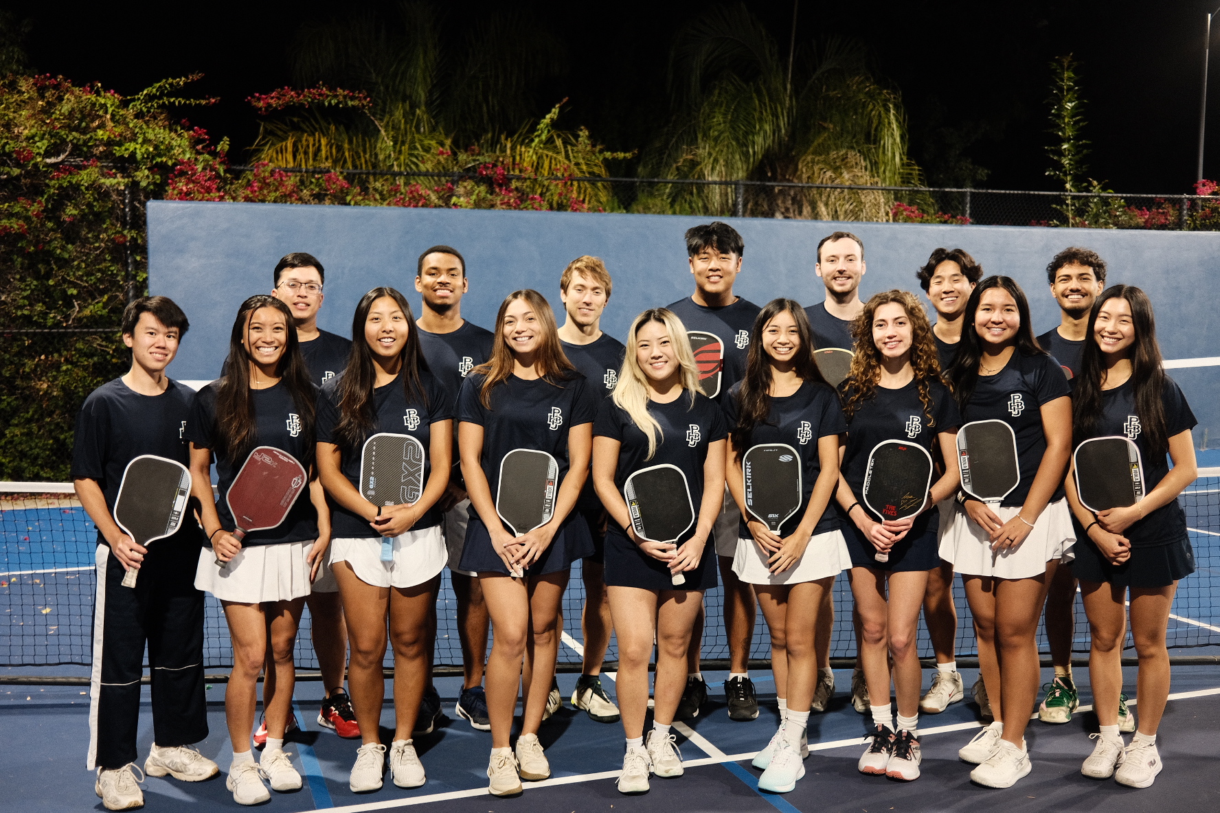
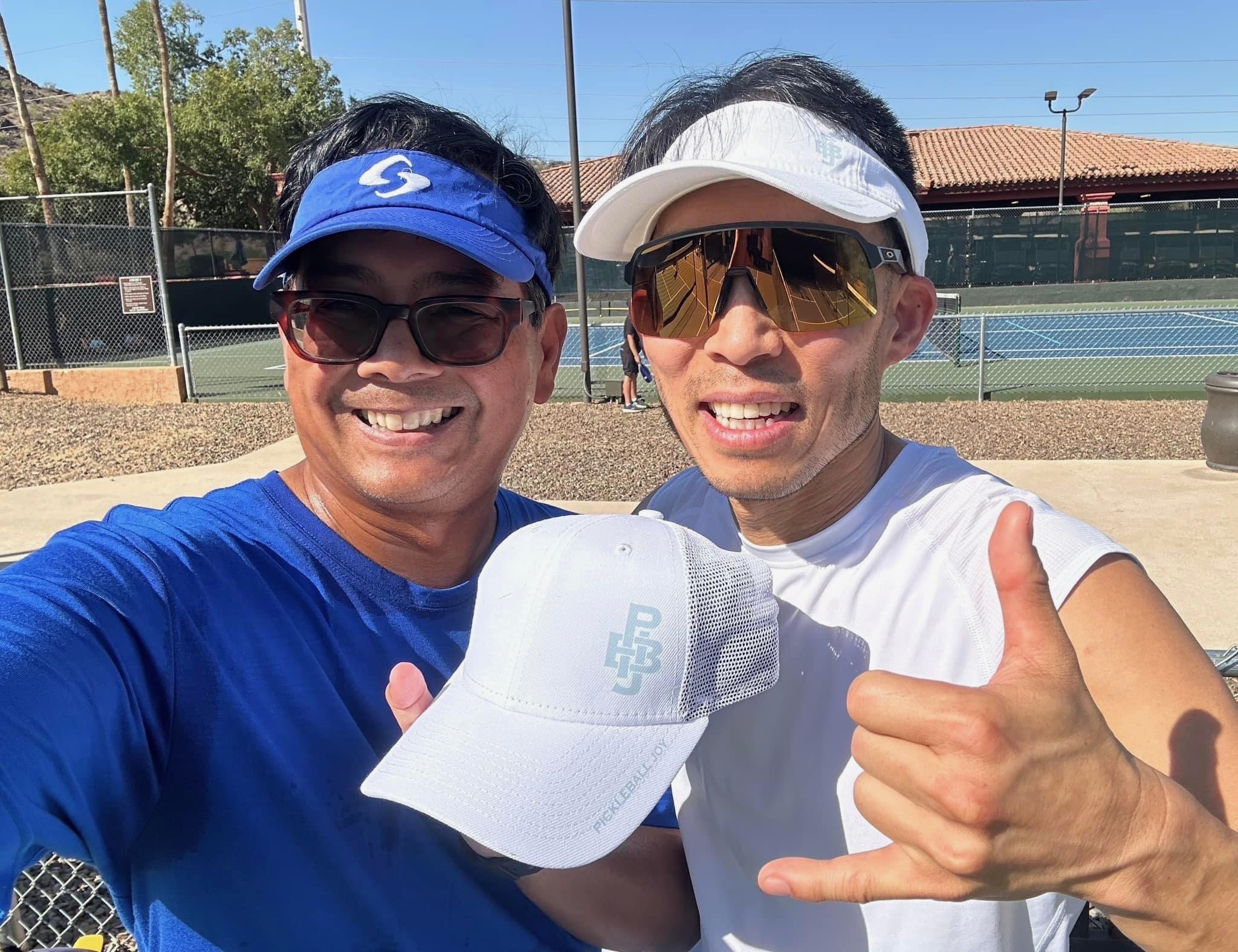
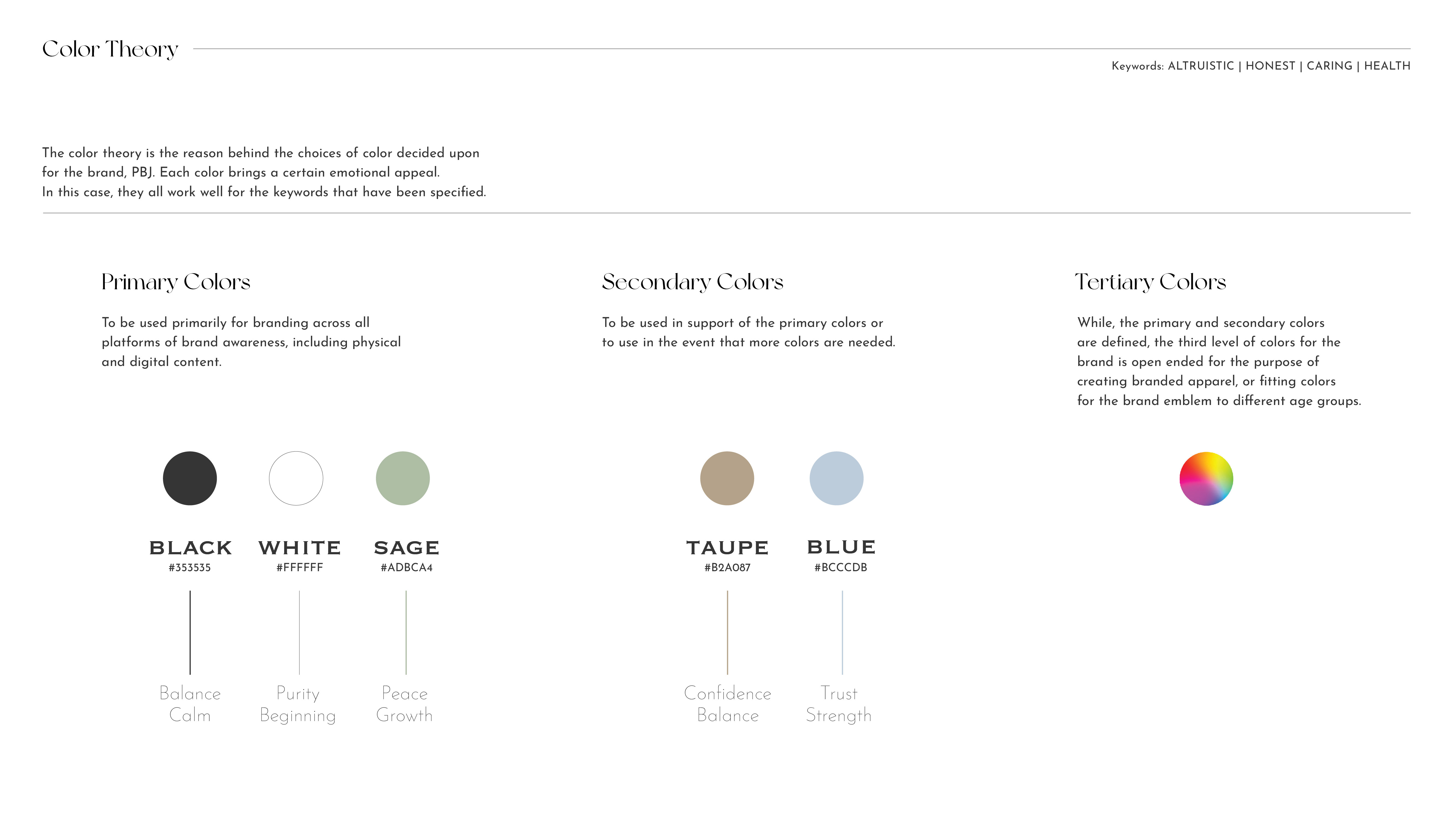
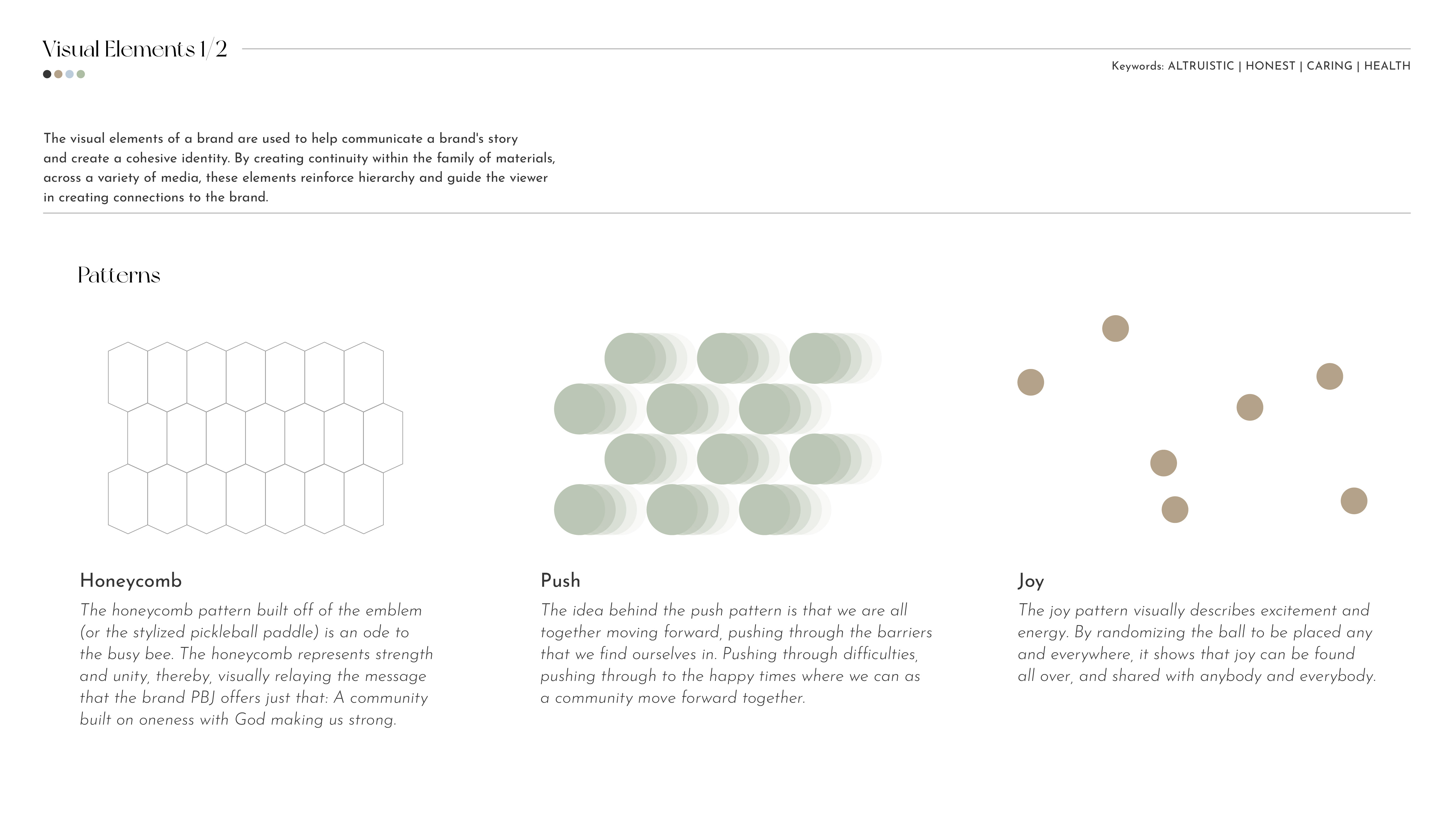
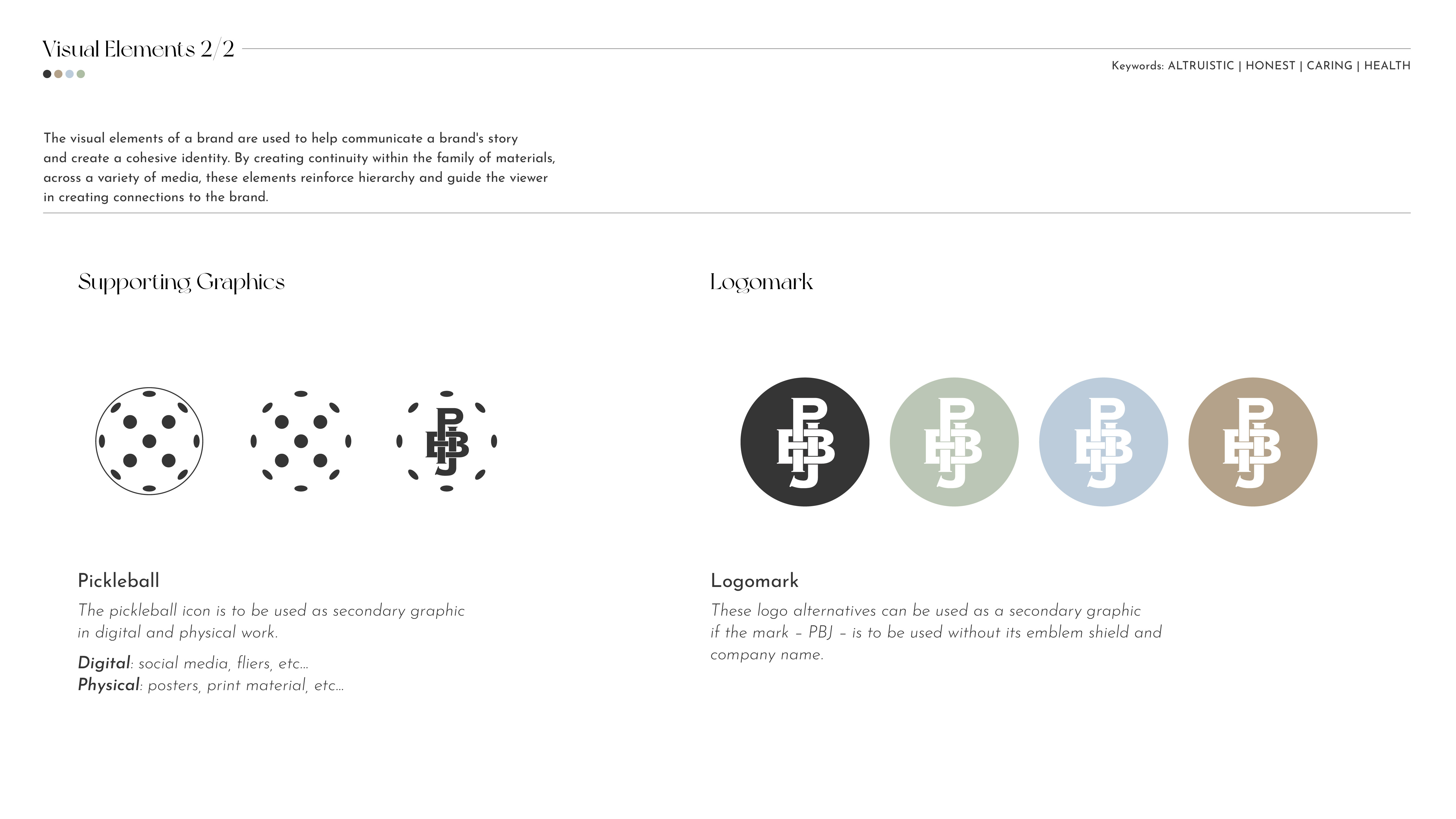
Pickleball Joy’s brand guidelines are designed to capture the energy, inclusivity, and playfulness of the sport while maintaining a clean, cohesive visual identity. The system balances bold, modern design with approachable, human elements—making the brand feel both active and welcoming. These guidelines ensure that whether Pickleball Joy appears on apparel, digital platforms, or in-person events, it always communicates movement, community, and joy in a consistent and recognizable way.


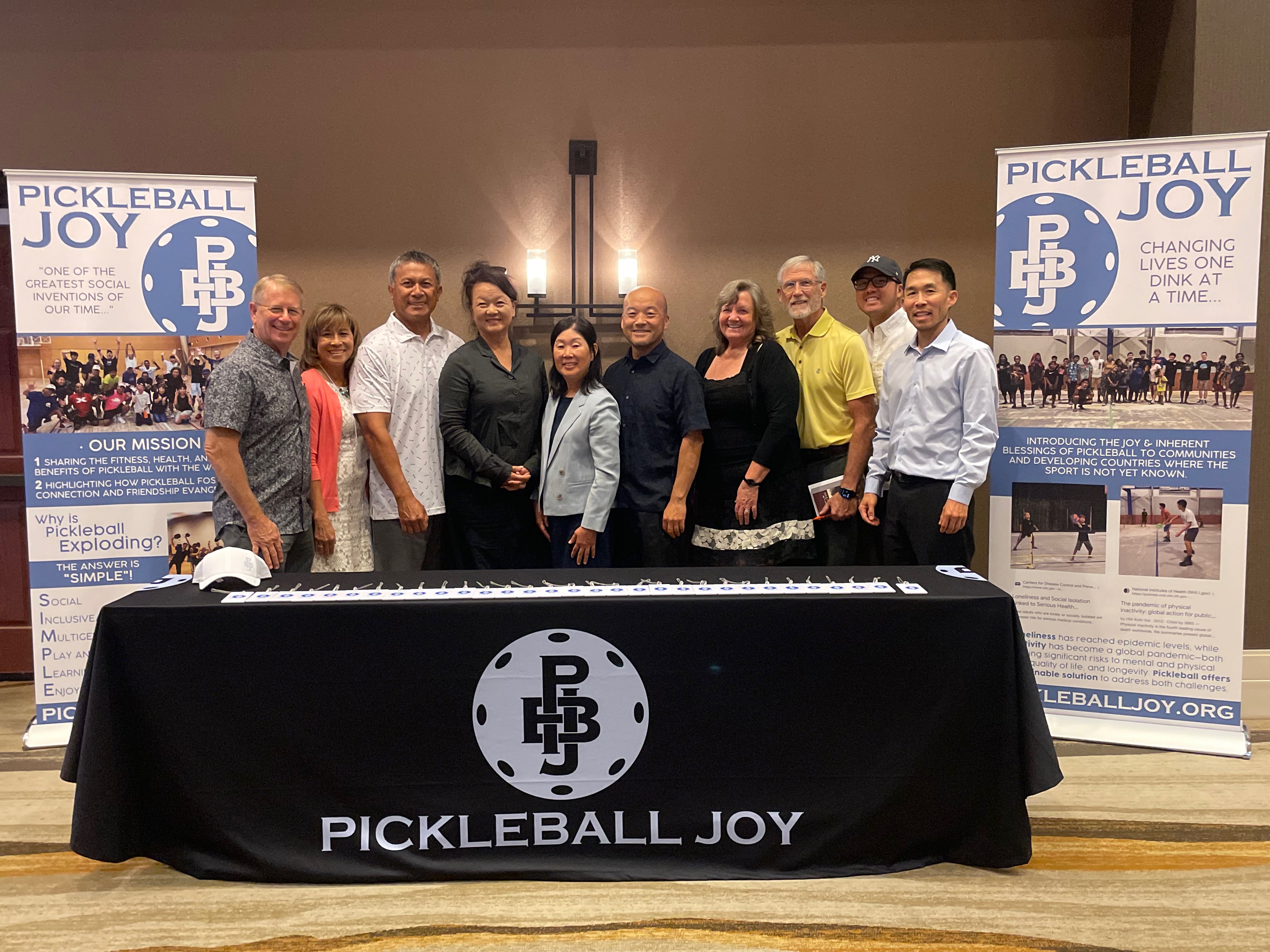
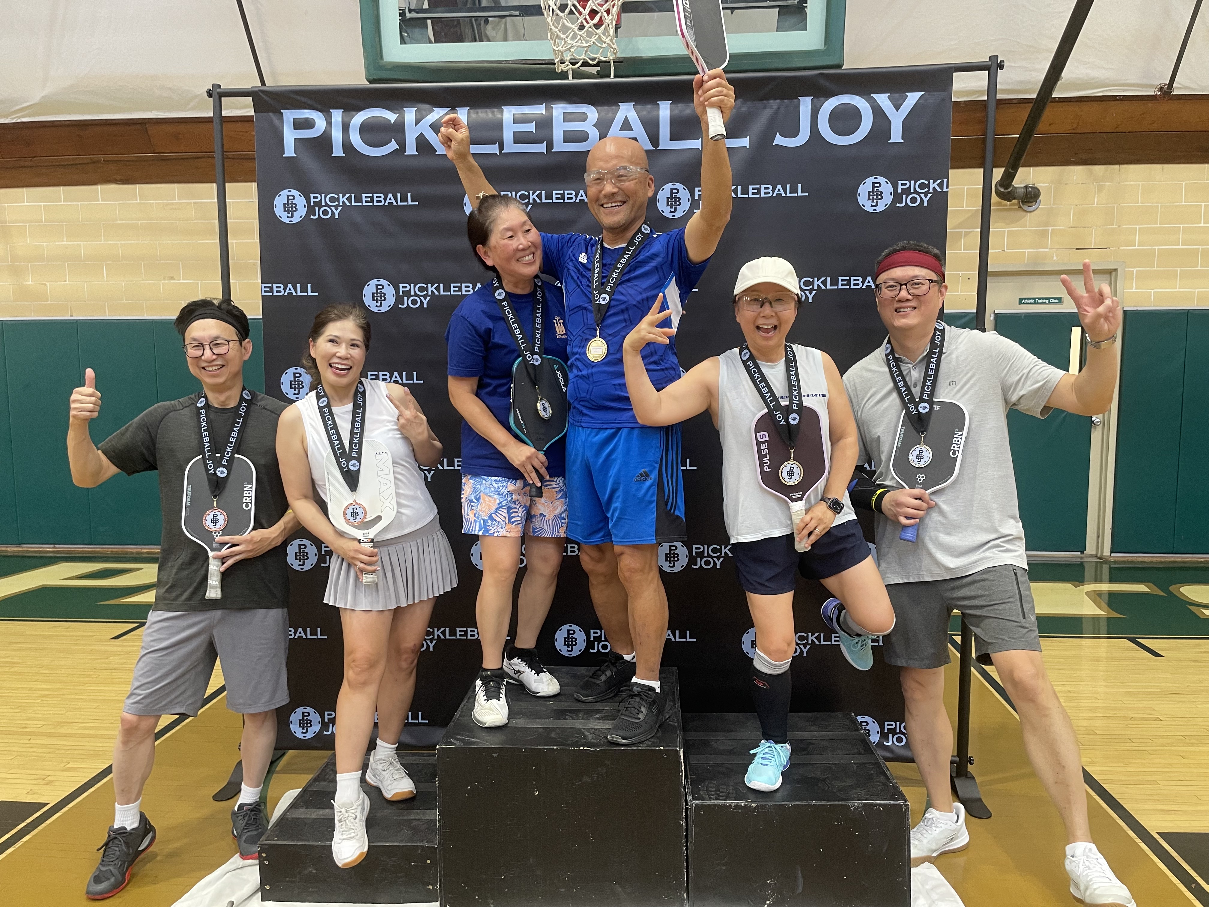


Once the brand identity was finalized, all brand assets and guidelines were delivered to the client for independent use. Ongoing real-world applications and future design executions following the launch were managed by the client, and were not produced by the original design team who developed the system.